基于R语言的热度图(heatmap)分析美国参议院投票两极化程度
热度图是什么,有什么好处,R中如何使用?
图,总是为了我们更直观地去理解问题,热度图也不例外,它让我们能够看清楚在哪一块数据值比较高,哪块比较低,这样也就可以看出其他一些信息,比如,某些块数据可能聚集了,在这些直观信息帮助下,可以指导我们下一步做什么处理,做聚类?数据特征降维?下面主要结合美国选举数据进行一些分析。
数据背景,美国主要有两个党派: 民主党和共和党,在进行选举的时候采用唱名投票(Roll call vote),数据从102届到113届,总共有11界,每届每个条目包括选举者所在党派,以及大部分收到的投票信息。
数据下载链接
下面我们就数据去得出一些结论。
初始数据进行一下处理,我们先对投票进行简化。
1 2 3 4 5 6 7 8 9 10 11 12 13 14 15 16 17 18 19
| data.dir <- '.' data.files <- list.files(data.dir, pattern = ".dta" ) rollcall.data <- lapply(data.files, function(f) { read.dta( f, convert.factors = FALSE) }) rollcall.simplified <- function(df) { no.pres <- subset(df, state < 99) for(i in 10:ncol(no.pres)) { no.pres[,i] <- ifelse(no.pres[,i] > 6, 0, no.pres[,i]) no.pres[,i] <- ifelse(no.pres[,i] > 0 & no.pres[,i] < 4, 1, no.pres[,i]) no.pres[,i] <- ifelse(no.pres[,i] > 1, -1, no.pres[,i]) } return(as.matrix(no.pres[,10:ncol(no.pres)])) } rollcall.simple <- lapply(rollcall.data, rollcall.simplified)
|
然后选取一届(这里选取最近一届113届)进行单个分析,
1 2 3 4 5 6 7 8 9 10 11 12 13 14 15
| k = 12 f = data.files[k] VotingMatrix = rollcall.simple[[k]] no.pres <- subset( rollcall.data[[k]], state < 99 ) SenatorNames = no.pres[,9] heatmap( VotingMatrix, scale="none", labRow = SenatorNames, cexRow=0.35, labCol = colnames(VotingMatrix), cexCol=0.1, col=c("red","yellow","green")) legend( "topleft", c('no','--','yes'), col=c("red","yellow","green"), lwd=3, cex=0.35, title=f)
|
可以得出热力图:
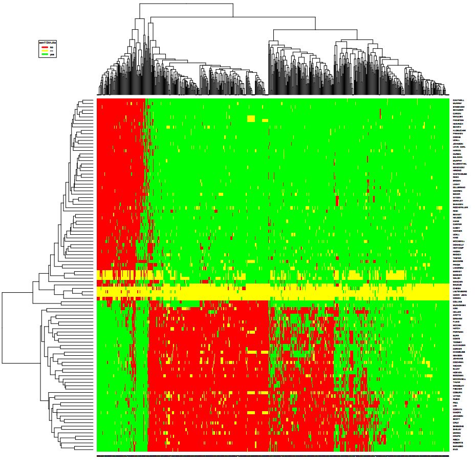
这是一个关于样本和特征之间关系的热力图,但是从图中我们看出了样本和样本之间的关系,就是红色的有聚集效应,代表了属于同一政党的参议员获得的支持有两极化趋势,(民主、共和两党选民的意识形态差距不断拉大)。
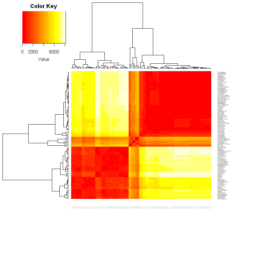
除了从样本和特征这两个维度做热力图,还可以对样本和样本之间的关系做热力图。
代码如下:
1 2 3 4 5 6 7 8 9 10 11 12 13 14 15 16 17 18 19 20 21 22 23 24
| library(gplots) rollcall.dist <- lapply(rollcall.simple, function(m) dist(m %*% t(m))) k=12 f = data.files[k] VotingMatrix = rollcall.dist[[k]] SenatorNames = (rollcall.data[[k]])[,"name"] heatmap.2(as.matrix(VotingMatrix), Rowv=TRUE, Colv=TRUE, distfun = dist, hclustfun = hclust, labRow = SenatorNames, cexRow=0.35, labCol = SenatorNames, cexCol=0.1, key=TRUE, trace="none", density.info=c("none"), margins=c(10, 8),) title(sub=paste('Roll Call Vote ',k+101,'th Congress'))
|
这里主要是对任意两个senator之间的距离进行衡量,然后通过这个距离矩阵做出热力图。
到此我们只能大致看出党派之间存在两极化,如何将这个两级化量化呢?这里我考虑使用聚类,然后用聚类中心之间的距离来衡量,(或许还可以考虑类内聚合度?)但问题是这里特征太多了,聚类结果不好可视化,我们可以使用MDS(Multi-Dimensional Scaling),R中有这样一个函数
1 2 3
| rollcall.mds <- lapply(rollcall.dist, function(d) as.data.frame((cmdscale(d, k = 2)) * -1))
|
再进行k-means聚类,计算两极化值
1 2 3
| mat<-rollcall.mds[[12]] cluster<-kmeans(mat,centers=2,nstart=1) polarization<-sqrt(sum((cluster$centers[1,1]-cluster$centers[2,1])^2+(cluster$centers[1,2]-cluster$centers[2,2])^2))
|
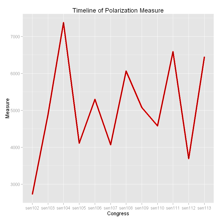
这样用同样的方法计算出另外几届的两极化值就可以画出趋势图了:
1 2 3 4 5 6 7 8 9 10 11 12 13 14 15 16
| polarization_index_list=list() for (k in 1:length(rollcall.mds)) { mat<-rollcall.mds[[k]] cluster<-kmeans(mat,centers=2,nstart=10) polarization_index=polarization<-sqrt(sum((cluster$centers[1,1]-cluster$centers[2,1])^2+(cluster$centers[1,2]-cluster$centers[2,2])^2)) polarization_index_list[[k]]<-polarization_index } Congress=list('sen102','sen103','sen104','sen105','sen106','sen107','sen108','sen109','sen110','sen111','sen112','sen113') Measure=list(polarization_index_list) dfTimeSeries=do.call(rbind,Map(data.frame,Congress=Congress,Measure=polarization_index_list)) ggplot(dfTimeSeries, aes(x = Congress, y = Measure,group=1)) + geom_line(colour="red", linetype="solid", size=1.5)+geom_path()+xlab("Congress")+ylab("Measure")+ggtitle("Timeline of Polarization Measure")
|
最后得到的趋势图为